

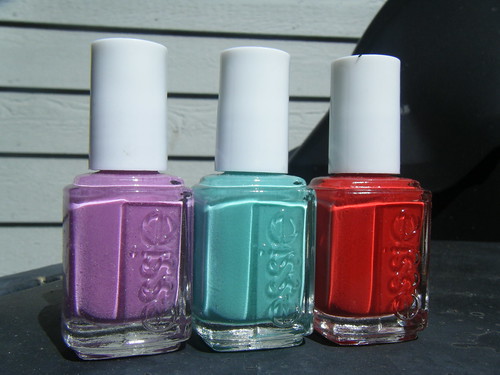
I just received a few samples from Essie to review- two from the upcoming Resort collection, and one from the spring 2010 collection.
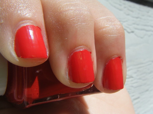
Starting off, we have the lovely Red Nouveau.
After hearing about the ridiculous sheerness of most Essie polishes, I was extremely pleased to open this hottie up, and discover a one coater. I did two coats in this picture because I have a hard time breaking habit, but it could have easily been a one coater. This color is described as a "fiery hot crimson", which I find very accurate. This picture is quite accurate, except that the polish is just a tiny bit cooler IRL. It looks to me like the color of a frozen tomato (yes, I do freeze tomatoes). It's a great polish for casual events, but I wouldn't use it at work.

Next up is A Splash of Grenadine, from the summer 2010 Resort Collection. ASoG is a really nice cool-toned pale pink. It's described as "playful magenta pink", which I don't exactly agree with- I don't see much magenta at all. This swatch is 3 coats, but they were rather thick so perhaps four for the very thin-coaters out there. The application had no issues at all, but it was nothing special either. I love this shade because although there are a lot of pinks, this one is quite unique- I've never seen anything like it. I also love the name, though in real life Grenadine is a deep red... perhaps that's why it's only a splash of Grenadine. This shade is great for anything, I think it's very work appropriate. Overall, very nice.
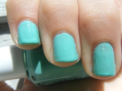
Last but not least is my personal favorite, Turquoise & Caicos. Though it didn't turn out exactly how I expected it to look (In my mind it looked much bluer- more teal than turquoise), this is a really nice shade, and very unique for Essie. The color is less vibrant in real life, a bit more on the pastel side. Essie describes this color as a "flirty and tropical pretty aqua", which is pretty spot-on. This swatch is three normal coats. Application was fine, it did get a bit streaky on my ring finger but that was my fault, I rushed this one. I don't really like this color on me, as I don't like any form of mint/pale green on me at all. I think it's look wonderful on people with either really tan or really pale skin though. Though it's definitely not work appropriate, it's not overly obtrusive either, making it a great, versatile shade.
Thanks for reading, guys!
**These were sent to me by the company for review.
1 comments:
The last one is really nice, I haven't seen anything like it before :)
Post a Comment